Art Essay-Motherwell, Acrylic on canvas
I. Introduction
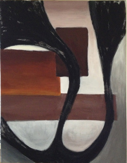
This artwork is a modern piece based on an American artist Robert Motherwell’s style using acrylic on canvas. It uses lots of abstract techniques and texture. My artwork is also a combination of Eastern and Western art, since there is one part of my artwork that looks a lot like the Chinese calligraphy.
II. Robert Motherwell
Robert Motherwell, 1915-1991, an American artist who was born in Washington. He was one of the most representative artists of abstract expressionism. Robert Motherwell is one of the founding artists of the New York School of abstract expressionism, and is associated with fellow artistic giants Jackson Pollock, Ad Reinhardt, and Barnett Newman. Most of his works shows his understand of life, death, peace and wars. He liked to have big shapes with black and white color. He liked working on canvas using acrylic. And his “automatic” drawing, which looks a lot like the Chinese calligraphy, has a huge impact on the generation after him.
III. Composition of the Artwork
There are three layers in my artwork. The first one is the background. The second ones are those patterns and the third one is the calligraphy. The patterns and the calligraphy are very dominant parts in my work. For the patterns, they are mostly rectangles, which are composed by straight lines. For calligraphy, I used curve lines to put it together. This artwork is a combination of both curve lines and straight lines, which shows a strong contrast and rhythm.
IV. Calligraphy
a. Shape
The calligraphy is based on a Chinese character “山”, which means the mountains. The shape of the calligraphy comes from that character. However, I made some changes to it. I made it more curvy and abstract. For those curve lines, consider making it too much the same will lose the rhythm and balance so I decided to make some part of the curve lines thinker than the others. Combining thick lines and thin lines can show the rhythm and movement of the artwork.
b. Texture
Like I mentioned before, Motherwell wants to achieve the unconscious felling in his work, his drawings look a lot like the Chinese calligraphy. Chinese calligraphy emphasizes on its texture and the way you use the brushes. This time we use big brushes to achieve the Eastern painting style. For some parts, I use very dry color and for some parts, I use my color with some water. The dryness of the color can create a different feeling for my calligraphy. First, my calligraphy won’t look the same. Second, it will have a three-dimensional feeling. Third, it helps to achieve the rhythm better.
V. Patterns
a. Shape
When I was studying Motherwell’s drawings. I discovered that his works are not only very abstract but also very balance, simple and clean, which is very important and hard for an artist to achieve that. Looking at his works, you won’t see many unnecessary things or decorations. So in my own artwork, I didn’t draw many things in the middle, instead I drew three patterns, all rectangles. Three are three rectangles lying on the second layer of my artwork; they are similar but still different from each other.
b. Space Relationship
As you can see in my artwork, I put the patterns in the middle. The reason I did this was because I think it can create a kind of full feeling, and meanwhile create a contrast with the surrounding part since there aren’t many things in the surrounding part, except for the calligraphy. And as you can see, I didn’t put those three rectangles far apart from each other, instead, I put them together; I even use some parts of one rectangle to cover another one. The reason why I did this was because, first, I want it to be balanced; and second, by doing that, I want to achieve the three-dimensional feeling within my artwork, like what Pablo Picasso did, using two-dimensional pattern to achieve a three-dimensional feeling.
c. Color & Texture
During the process of finding the right colors, I did many palettes. Almost every time, I would make some changes to my color. For those patterns, the original colors were sandy beige, yellow, orange, and a little bit dark brown. But now, I have very dark brown, chocolate brown, brownish orange, yellow, bright brown and also mixed with some white. I used the technique of gradation so there are always changes in my colors. And the texture in these three patterns can divide into two categories. One is horizontal, and the other one follows the direction of the calligraphy.
VI. Background
a. Composition
One of the most characteristic things in Motherwell’s drawings is that, it reminds people a lot of the Chinese calligraphy. The rhythm of the calligraphy expresses Motherwell’s feelings. And furthermore, Motherwell’s like to use black and white because they represent the bright and dark of the life. Chinese calligraphy is all about black and white. One thing that Motherwell has discovered from the Chinese calligraphy, “The white space itself is a beauty”. When I was composing my artwork, I remind myself to leave some white part, not only to have the contrast, but also follow the lead of Motherwell. So there’s a bright part in my drawing, but the surrounding part a lot darker.
b. Color
For the background, I can divide it up into two parts: at first, they were all white. But then, it started to be different. For those parts that are inside the calligraphy, it has bright color and I used a lot of gradation. At first, I have reddish white on the top, and greyish green at the bottom. But after I did a few more palettes, now, I have reddish and brownish white on the top, and brownish white and greyish white at the bottom. These are inside the calligraphy. For the part that is outside the calligraphy, I made it darker and still I used gradation. I want to achieve the balance of colors.
I think, the dark patterns and bright surroundings (inside the calligraphy) have created a contrast in my work. And the dark patterns and the dark surrounding (outside the calligraphy) have shown the connection within my own work. When I was painting, I used my colors very thick and I used different texture, so that it won’t give the audience a feeling that it all looks the same and it also gives my work some rhythm.
VII. Concept
The idea of my artwork comes from Chinese poems. My work is based on poems about Sothern China’s views. Back in the Tang dynasty, there were lots and lots of poets who like to write about the “Jiang Nan”, which is the southern China. I guess mostly it’s because Jiang Nan is such a place that can have different emotions. And it’s a place has both rivers and mountains. It’s a place that people can relax.
Actually, at first, I found a specific poem about Jiang Nan. However I can’t exactly express the meaning of the poem but I know the poem was describing the view of Jiang Nan: rivers, mountains, fields and also the peaceful life there. During the process of composing, I felt like I can’t express the feeling of the poem accurately by drawing, especially an abstract drawing, so I decided to only describe the view through my drawing. My calligraphy itself means mountains and the shape of my calligraphy also represents those long and curve roads on mountains. Those patterns in my artwork represent houses and fields. Very obvious that brown is a very dominant color in my work. I used several different kinds of brown. The reason that I chose to use it was because I think by using different kinds of brown can give a very peaceful feeling, just like the feeling that my drawing is trying to have.
VIII. Conclusion
Great artists often have big influence on others no matter they are alive or have passed away. Robert Motherwell was one of the greatest abstract expressionism artists in the history and he still has a huge impact on the artists of today. From studying his artworks, I learned how to make my work more balance, clean and simple and I hope those can become the key words of my artwork.
By Kathy Chen
On June 15, 2013
